The Brand Guide — Foundations


Brand Identity · 2024
A complete brand identity system — logo, colour, typography, and a 32-page brand guide built so a non-design team can apply the brand consistently from social to print.
The Brief
Arujiva needed a brand identity built from scratch — no logo, no colours, no guidelines existed. The brief was open: position the brand as credible, modern, and distinct in a category where most competitors use the same visual language.
The core challenge was strategic, not aesthetic: how do you create something that feels confident and established without looking like it's trying too hard? The system had to work across digital, print, and social — all from a single coherent base.
The Brand Guide — Foundations
Approach
Most brand projects start with the logo. This one started with the system. Before drawing a single mark, I mapped out how the brand would need to behave — on a business card, on a social post, on a document header, on a building sign — and that exercise defined the constraints.
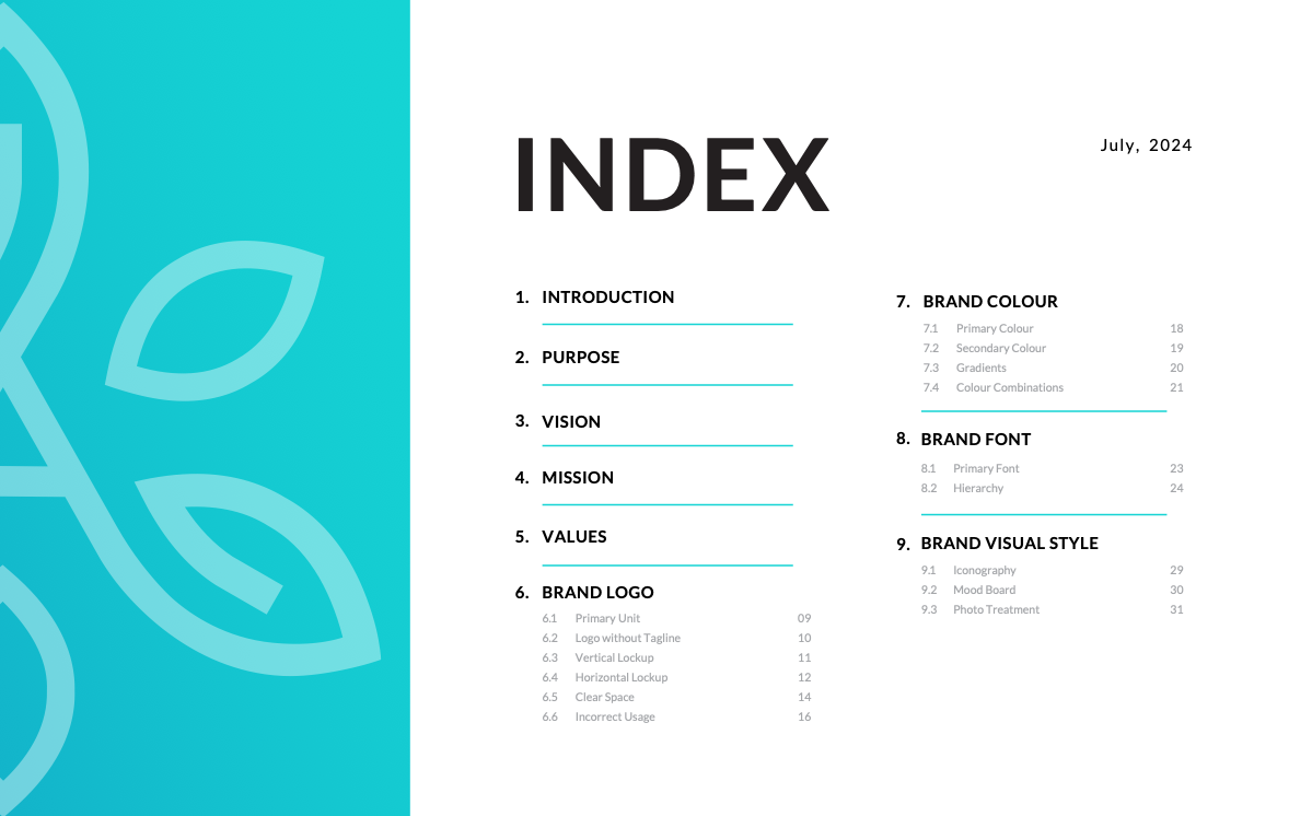
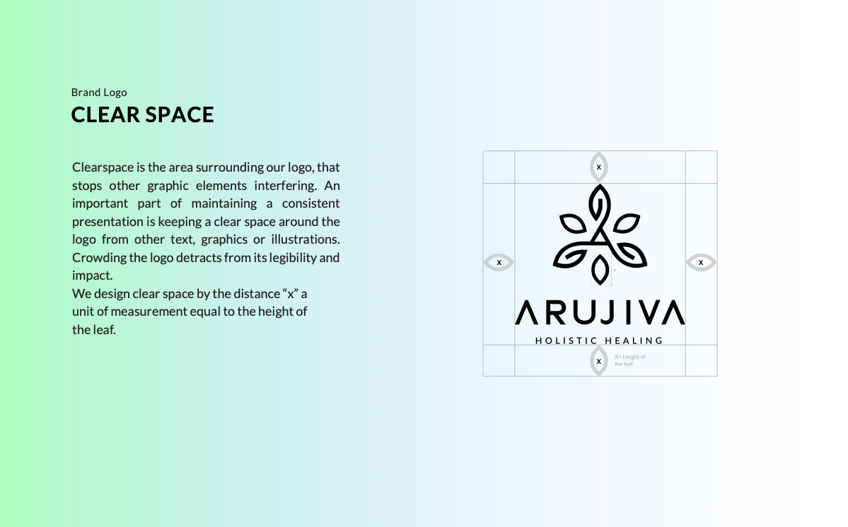
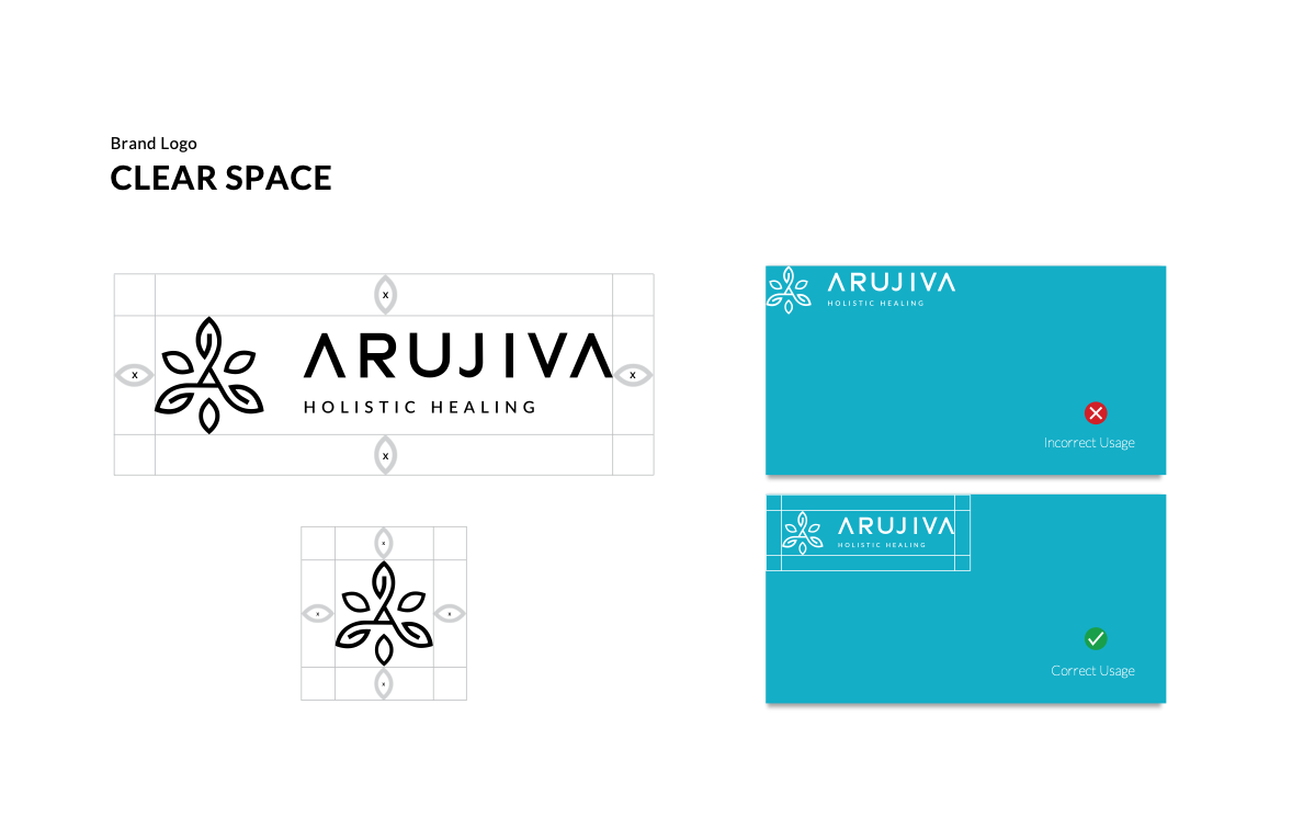
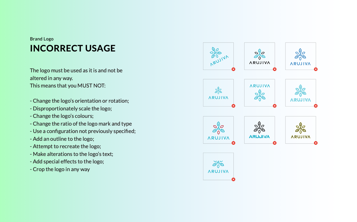
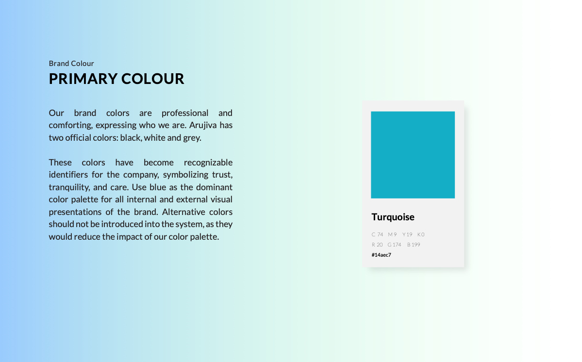
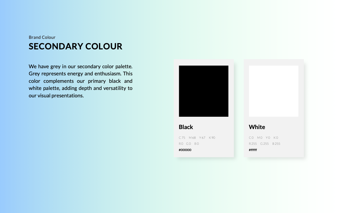
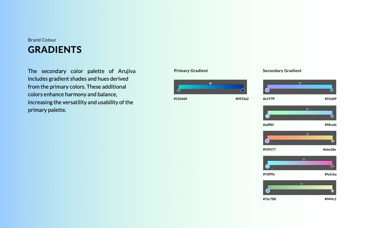
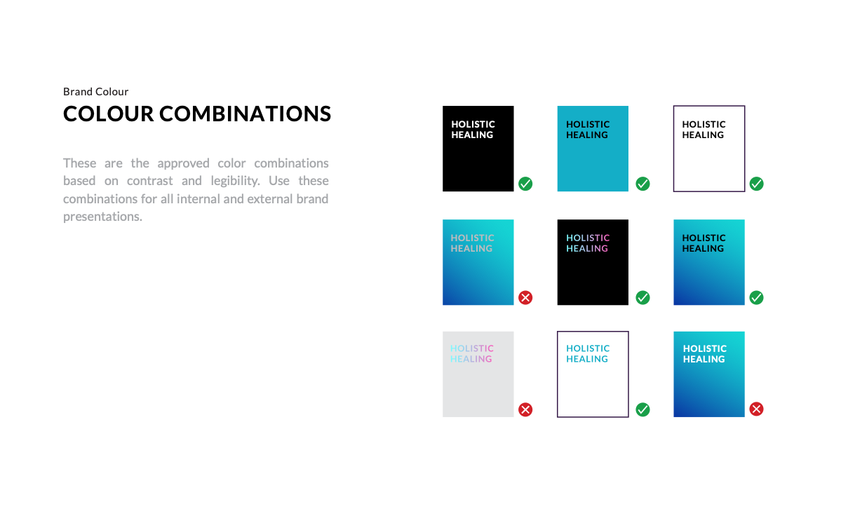
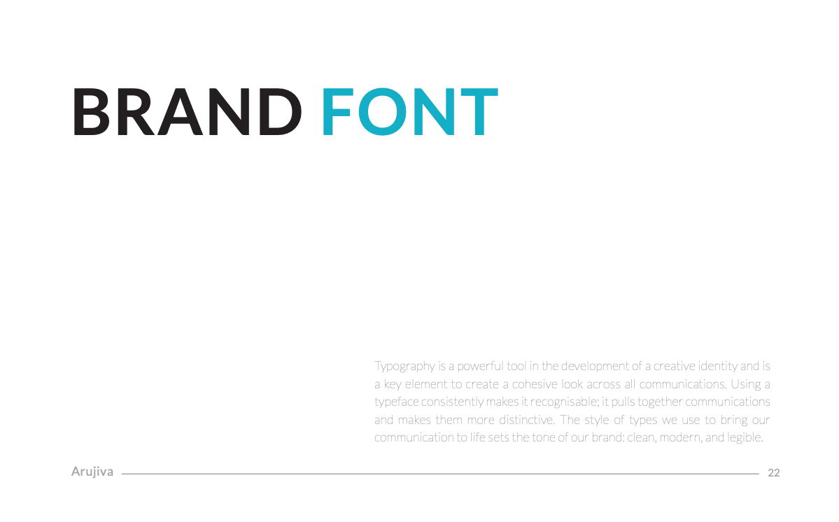
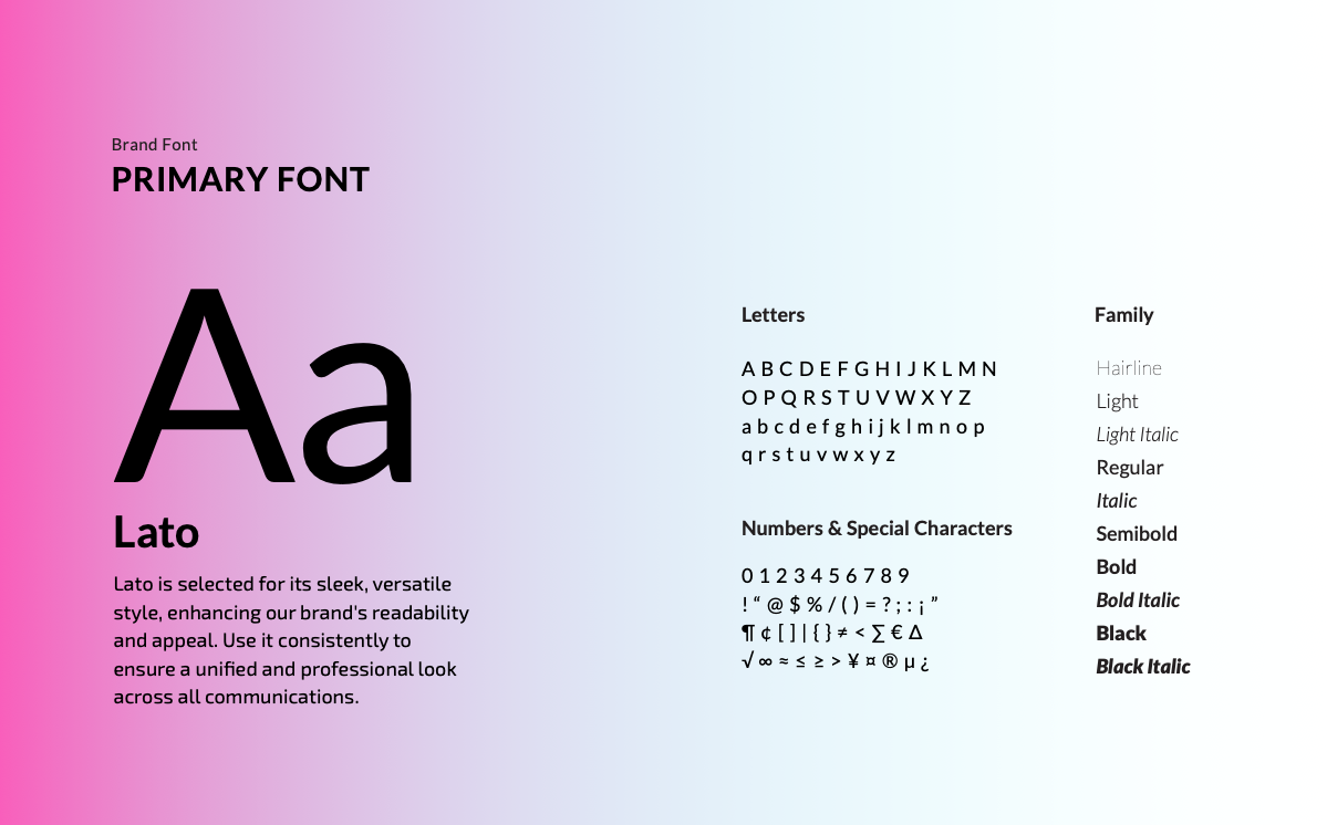
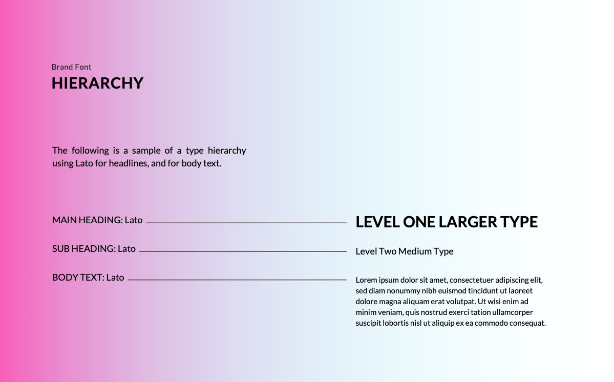
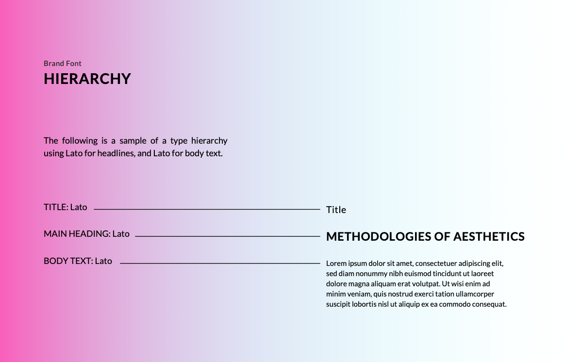
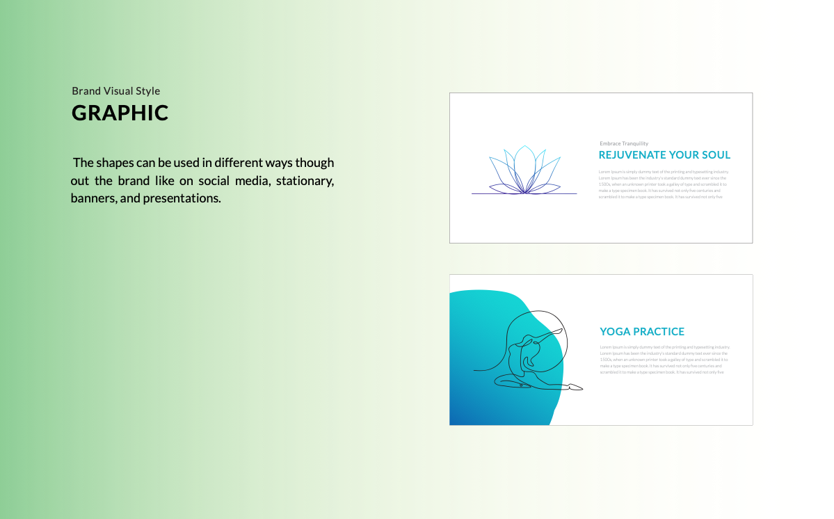
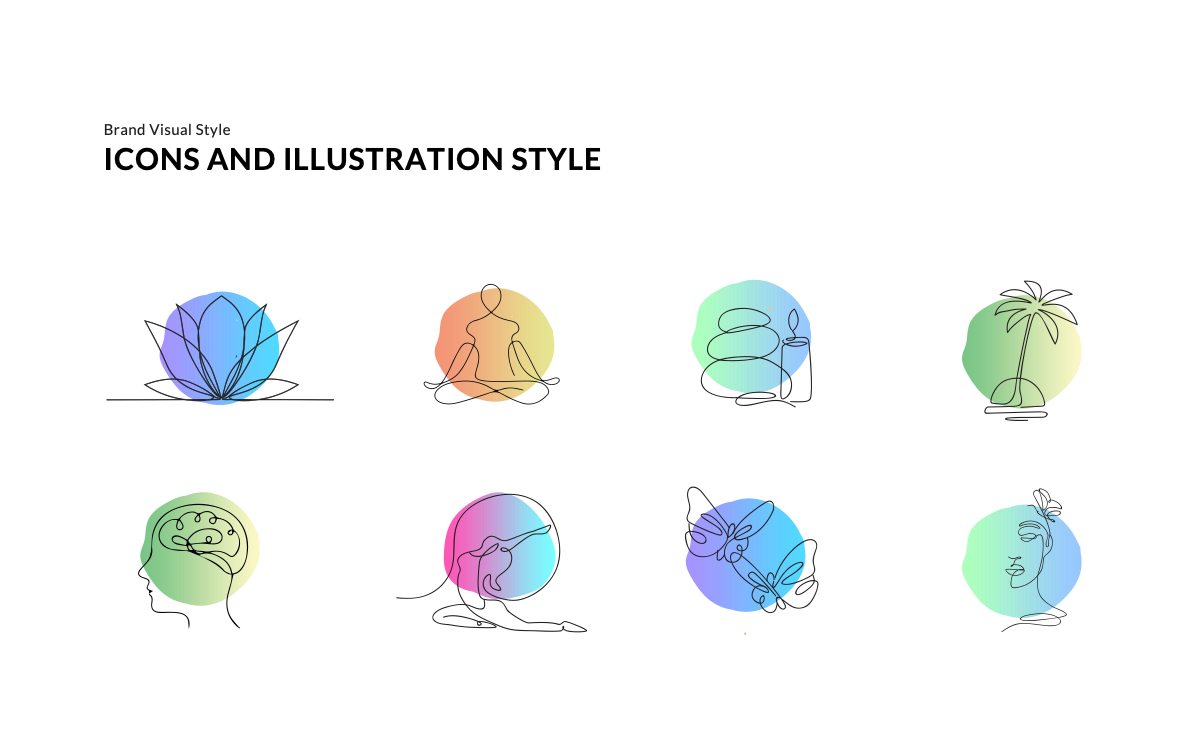
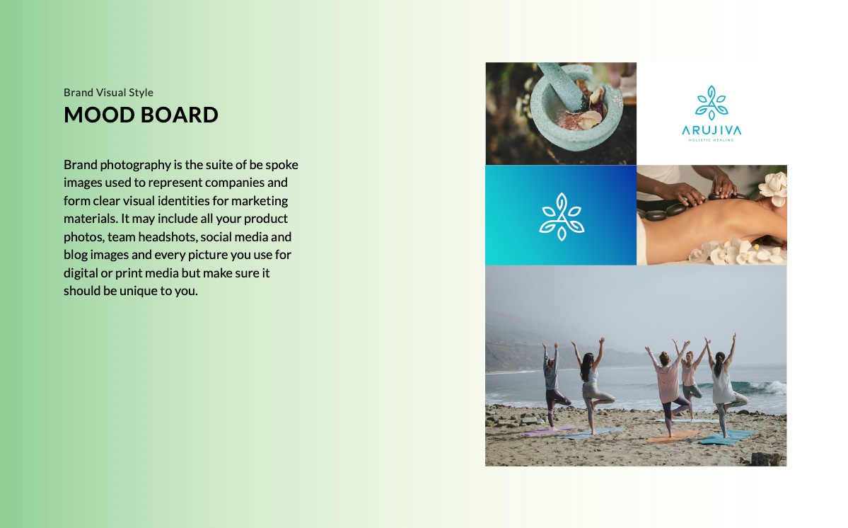
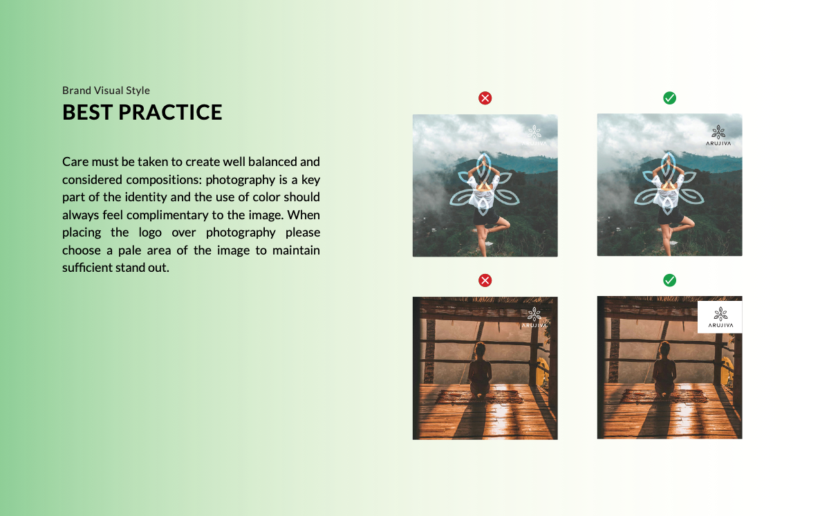
The final system was documented in a 32-page brand guideline PDF covering: logo usage rules, clear-space requirements, colour values (HEX, RGB, CMYK), type scale, and a set of do / don't examples for the most common misapplication scenarios.
Applications & Usage

Outcome
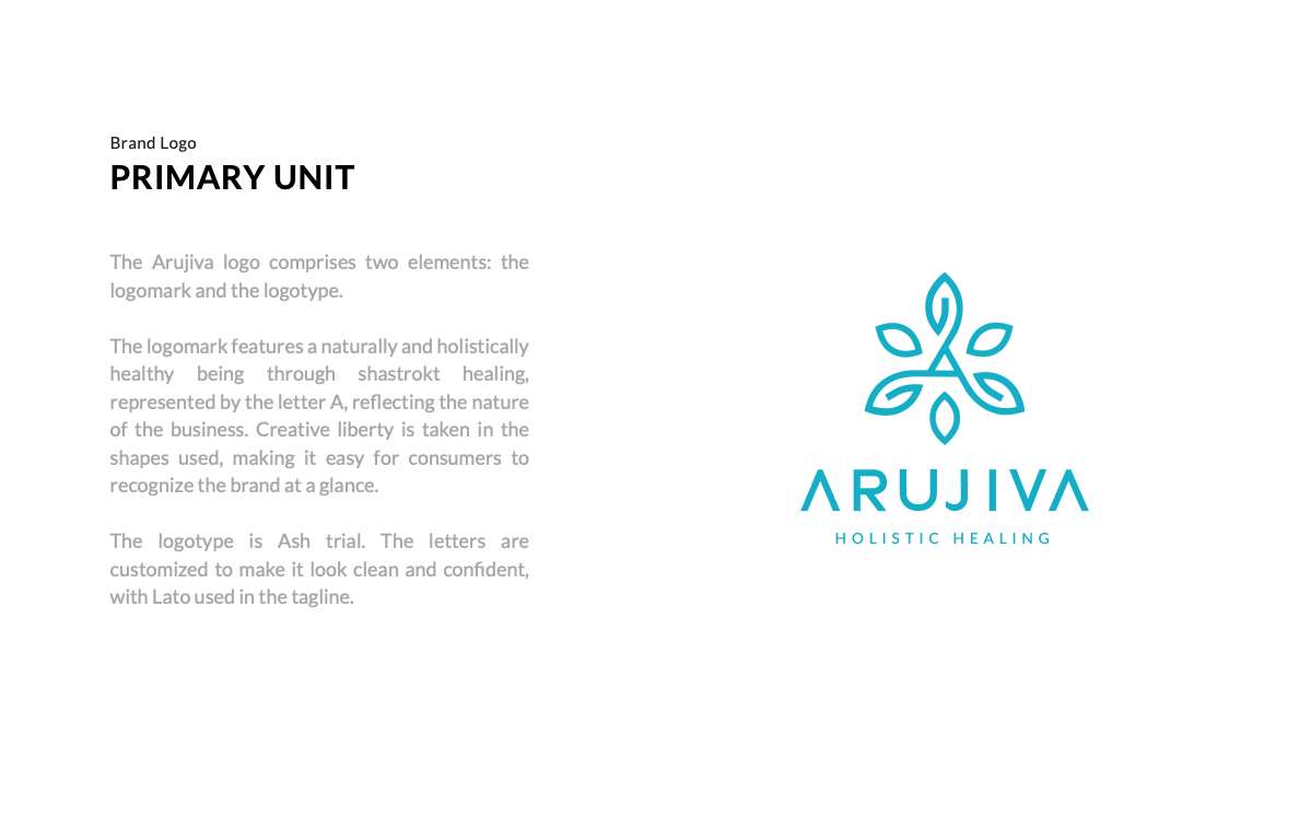
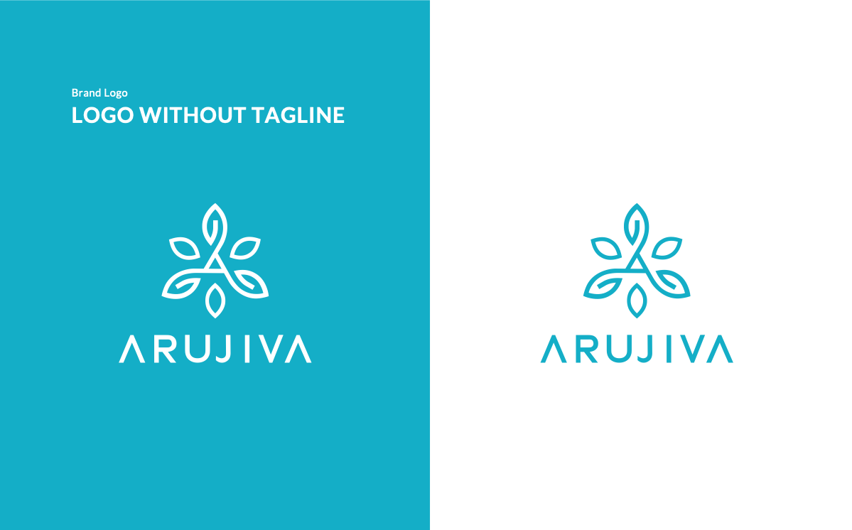
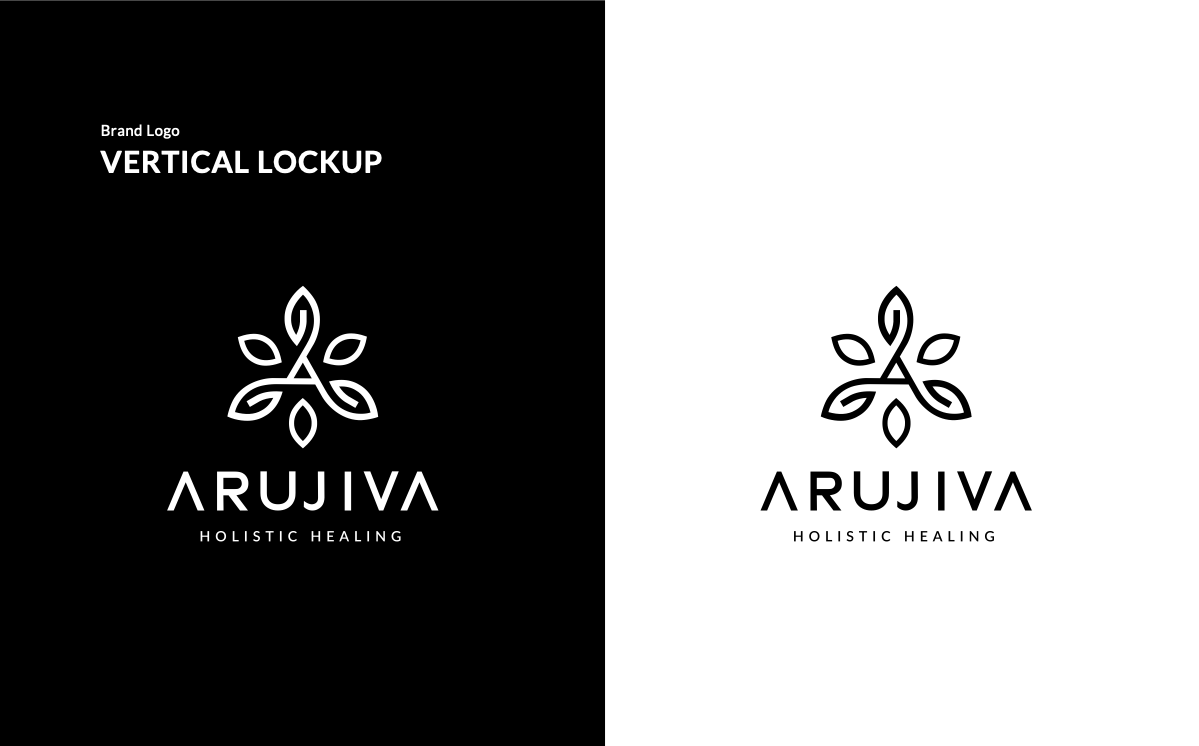
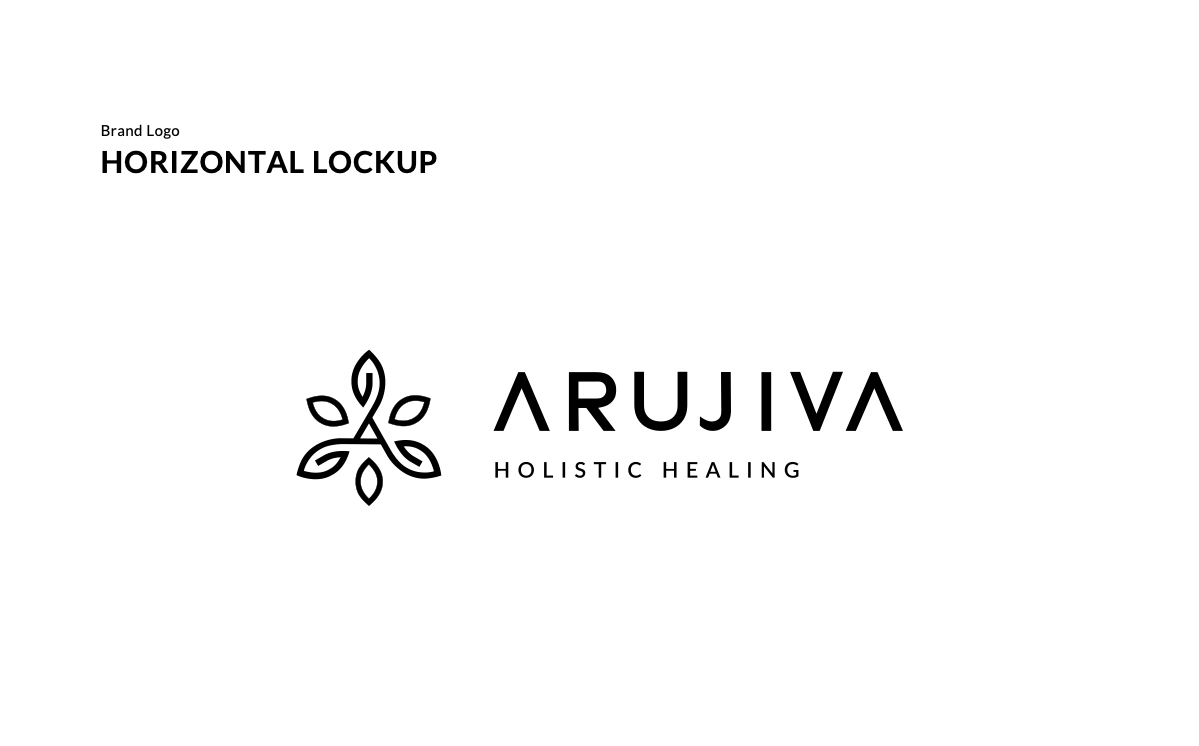
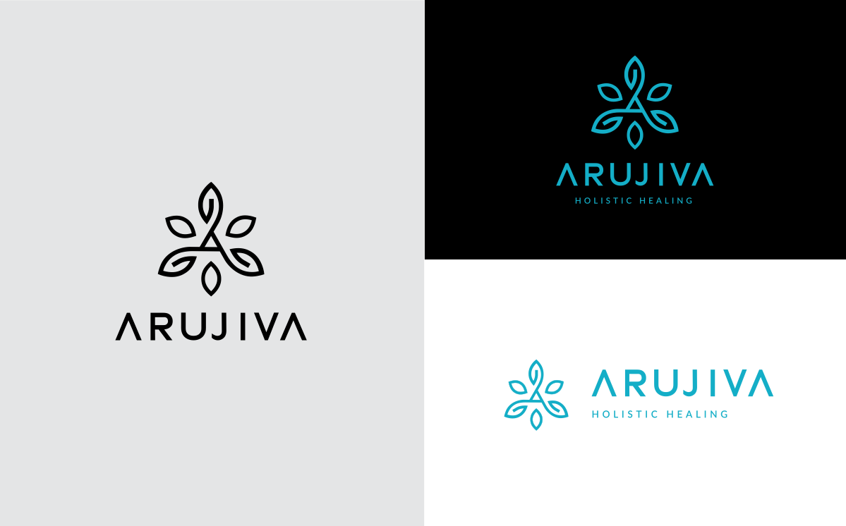
The final deliverable: primary and secondary logo lockups, a standalone mark for small-format use, the full colour system with print and digital values, a Lato-based type scale, and a 32-page brand guidelines document.
The client used the guidelines directly to brief their social media manager and web developer — both with no prior design experience. The system's clarity meant the brand stayed consistent from day one without ongoing creative oversight.
32pg
Brand guidelines document
4
Deliverable categories: logo, color, type, guidelines
100%
Freelance — brief to full system delivery