Brand Identity · 2024
Complete branding and logo design for Skyverrra Ventures — building a bold, ambitious identity for a new ventures brand that needed to signal confidence and forward momentum from day one.
The Brief
Skyverrra Ventures needed a brand identity built to carry ambition — something that communicated scale, vision, and momentum even before the company had its first round of projects. In the ventures space, visual credibility is currency.
The brief called for a distinctive mark that worked equally well on a pitch deck, a LinkedIn profile, and printed collateral — bold enough to be remembered, refined enough to belong in professional settings.
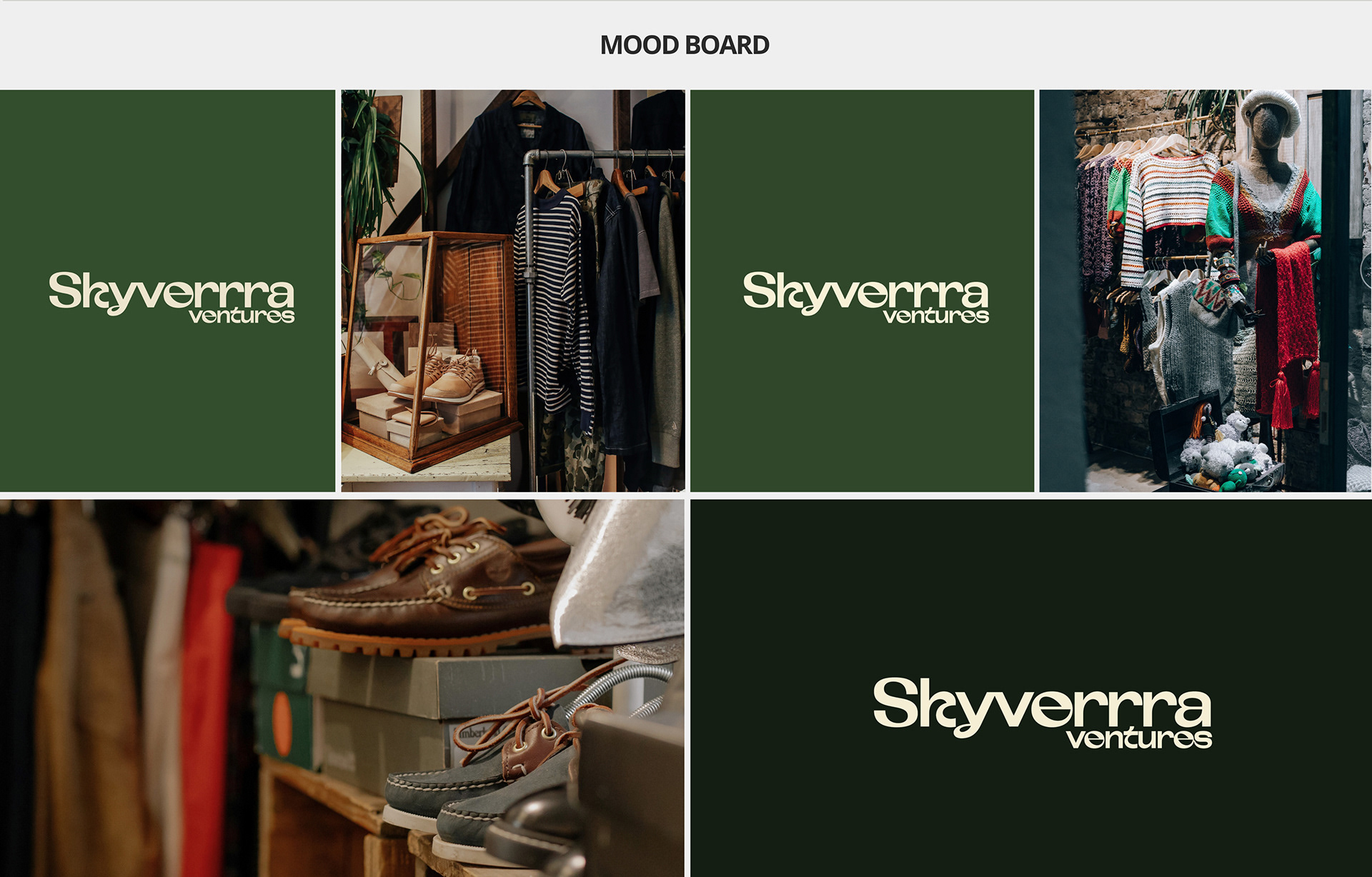
The deep navy-to-blue palette was chosen intentionally: it reads as authoritative and forward-looking without the corporate coldness of pure black. The triple-R in "Skyverrra" became an asset — a deliberate quirk that's immediately memorable.
PRIMARY
Deep Navy Blue
Ambition · Authority
ACCENT
Electric Blue
Energy · Forward motion
NEUTRAL
Off-White
Clarity · Space
Approach
Logo exploration started with the upward vector — a natural direction for a ventures brand. The final mark abstracts this into a clean geometric form: a contained upward shape that reads as momentum, growth, and altitude. Simple enough to scale to a 16px favicon, distinctive enough to hold as a standalone brand mark.
Typography was set in a geometric sans with high tracking on the brand name — the open letterforms reinforce the "sky" element of the name while keeping the wordmark legible at all sizes. "VENTURES" is set in lighter weight to create visual hierarchy without introducing a second typeface.
The name's unconventional spelling — three R's — was treated as a strength rather than a quirk to correct. It makes the brand immediately searchable and distinctive in any crowded digital feed.
Key Decisions
Decision 01
Black brands read as fashion or luxury. Navy reads as precision and ambition — it has the authority of dark without the coldness of pure black. For a ventures brand that needs to sit in both boardrooms and pitch decks, navy was the more useful choice.
Decision 02
Open tracking on "SKYVERRRA" creates a sense of space and scale — the name literally feels like it's reaching outward. It also reinforces the sky/altitude concept without needing an illustrative element. Typography doing conceptual work.
Decision 03
The icon mark was designed to function independently — as a favicon, as a social media avatar, as a stamp on physical collateral. The wordmark is secondary. This is the correct hierarchy for a brand building digital presence first.
Decision 04
Skyverrra needed to move quickly. The brand guide was designed to be concise — covering the essential rules without the overhead of a 50-page document. Clear, actionable, and built for a team that would be producing content fast.

Outcome
The final deliverables included primary and alternate logo lockups, a standalone mark for digital use, the complete color system, typographic guidelines, and a focused brand guide covering correct and incorrect usage.
The project received 44 appreciations on Behance, making it one of the most-appreciated projects in my freelance portfolio. The client applied the system across their LinkedIn presence, pitch presentations, and printed collateral from launch.
The brand's distinctiveness — anchored in the unusual name, the strong geometric mark, and the electric blue palette — gave Skyverrra Ventures a visual presence that punches well above early-stage weight.
44
Appreciations on Behance
3
Logo lockup variants delivered
100%
Freelance — brief to delivery